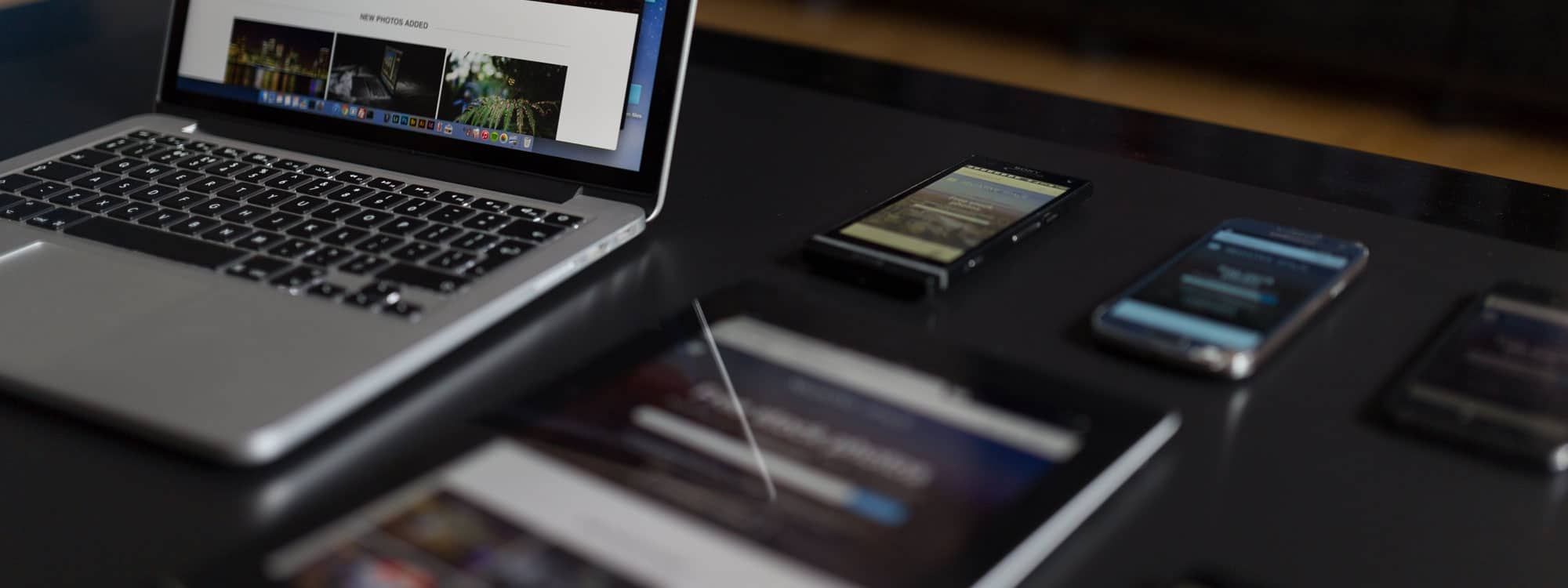
05 Feb Is your website working correctly on mobile, laptops and desktop devices?
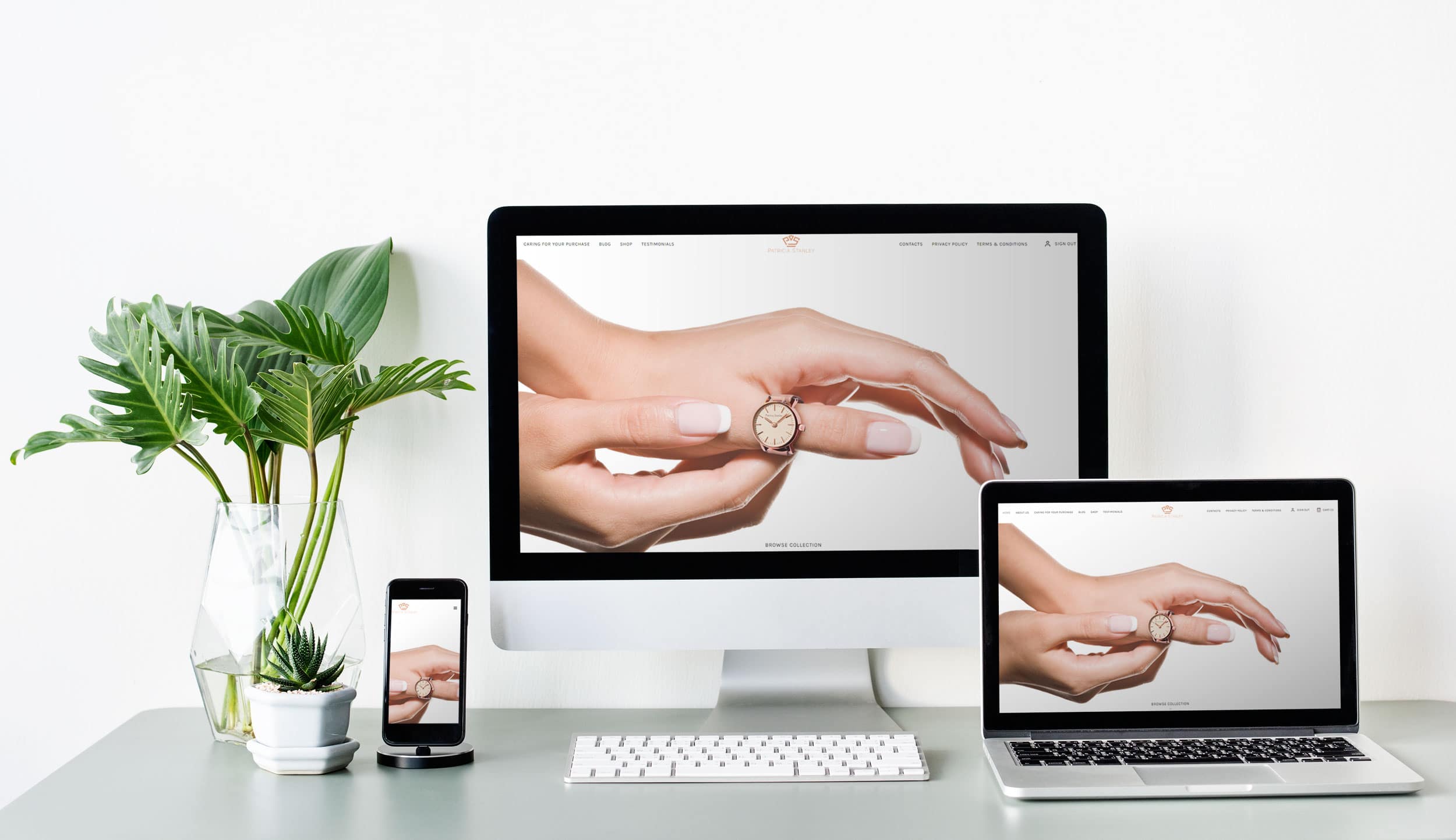
Over the years it has been increasingly important to make sure your website is working correctly on devices to include mobiles, laptops, PC and Mac’s.
You can easily check your website by using each individual device if you have them, however, if you use Google Chrome (like me) you can check all devices by right-clicking anywhere on the website page and then clicking Inspect. This will bring up the Developer Tools which will show all the HTML code and other things. If you click on the second icon from the left it will show a button called “Toggle device toolbar” which will show the website, you are visiting into a mobile responsive environment.
If you do this with your website, you will be able to check if everything looks and works correctly.
Some things to check…
- Check the logo is the right size, positioned correctly and not overlapping any content.
- Check the navigation works when you click on the menu or the hamburger menu if on mobile and you can easily click on the submenu items.
- Check the homepage image slider is working and showing the image correctly. Most of the websites we build have an image slider which can be full width or full screen for big impact. We use Slider Revolution (SR) to provide responsive images for all devices. Within SR it has 4 device modes to organise your content, those are Desktop, Laptop, Tablet and Mobile. I would highly recommend checking the content objects are the correct size and position. Sometimes on a mobile device, you may need to hide some objects as there might not be enough room to put all the content there. Your website may or may not use SR but check the image slider is working on all devices, then if not, speak to your web developer!
- Check all text has good spacing, margins and paddings to keep the text readable, sometimes the text can be too small or going off the page.
- Check the images are optimised to be the correct size, sometimes I have noticed that images are way too big and the browser is scaling it right down to fit in a small place. The good thing with WordPress is it takes care of this for you by uploading a full, large, medium, small, and thumbnail image for you. Always check though that the full image is not being used in a small space.
- Check contact forms are posting correctly on all devices, put in the message box the device you are sending the contact form from and make sure it is received.
- Check Google Maps are working correctly, all Google maps need an API key to work. Also, sometimes maps can easily be interacted with when scrolling past them which can make things difficult to browse the website.
- Check the footer is correctly formatted, usually, we design websites with 3 to 4 columns of content which will stack under each other. Make sure all the content in each column is displayed correctly with good spacing.
- Check that your chat message icons, messenger icons appear correctly and does not overlap any content on the website. These can appear in the bottom right which can overlap the “back to the top” button.
- Check any Pop-Ups on your website displays correctly. They will usually display correctly on a desktop computer but on a mobile device they can be too big and hard to close them down. Always best to check!
I think this covers most of the main things to check on your website. If you have a developer, reach out to him to make sure that your website is running at its best on all devices. Usually, if there is a small maintenance contract, he or she will take care of these checks for you.
Being a small business owner, it is good practice to be mindful of your website and have a quick check yourself. Rest assured it is running at its best but always best to check.
Happy browsing!
Sorry, the comment form is closed at this time.